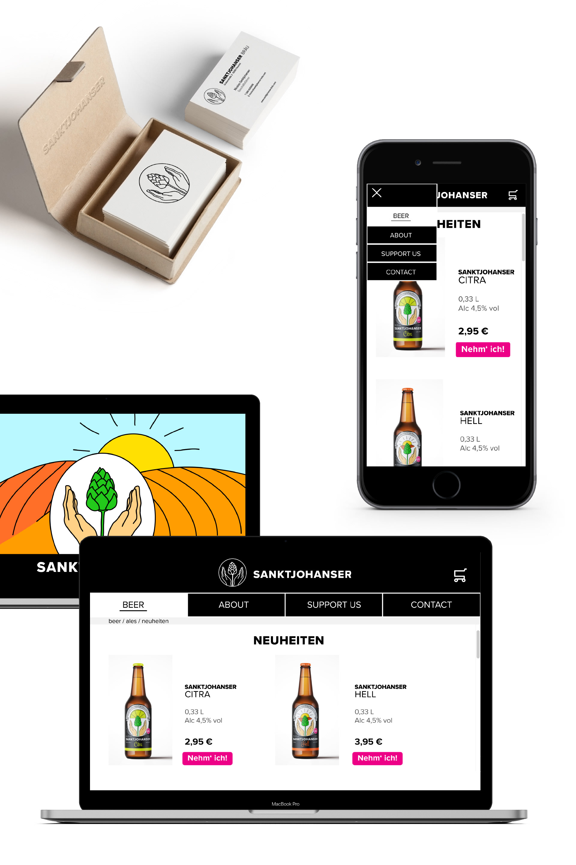
Branding, Illustration, Logo, Packaging
Personal Project
In this project for a befriended brewer, I followed the branding process as I know it.
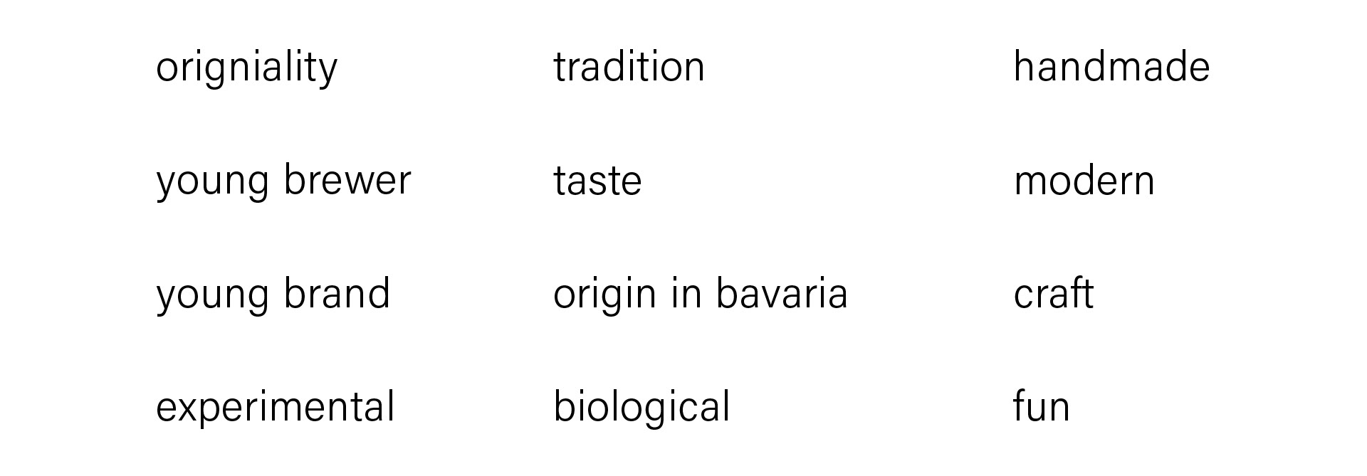
As first step, we talked about what values he wants his craft beer brand to communicate. The following adjectives were the result.
From this pool, three routes emerged, each emphasizing a different combination of these values.
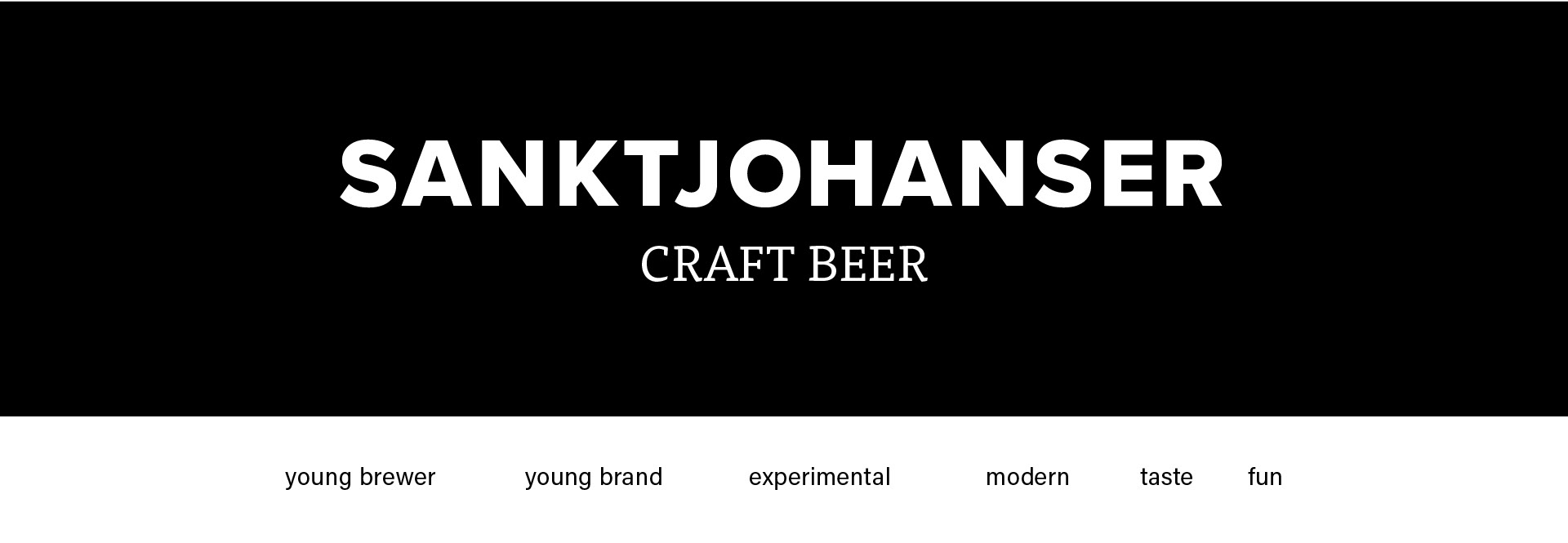
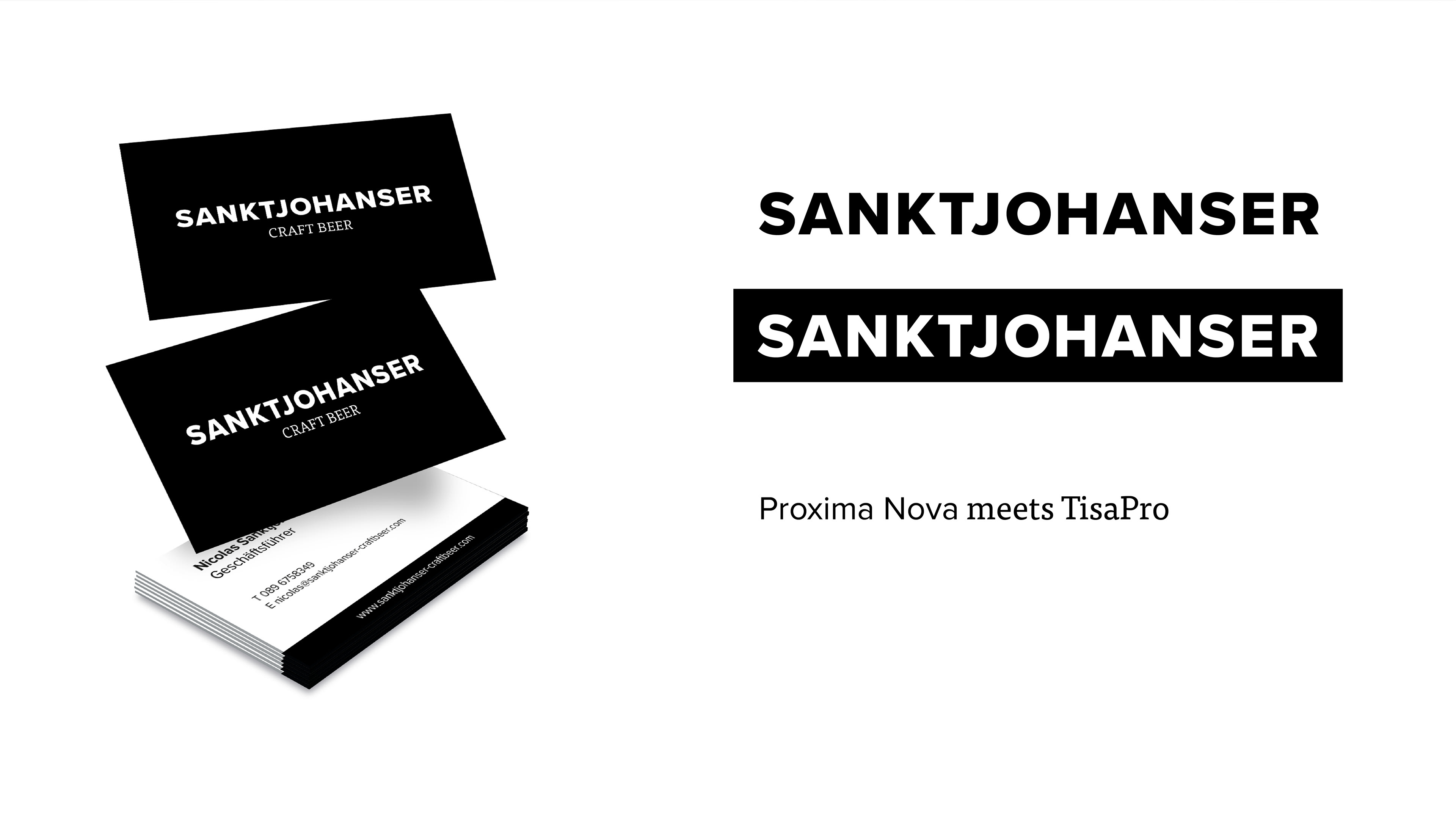
Route 1
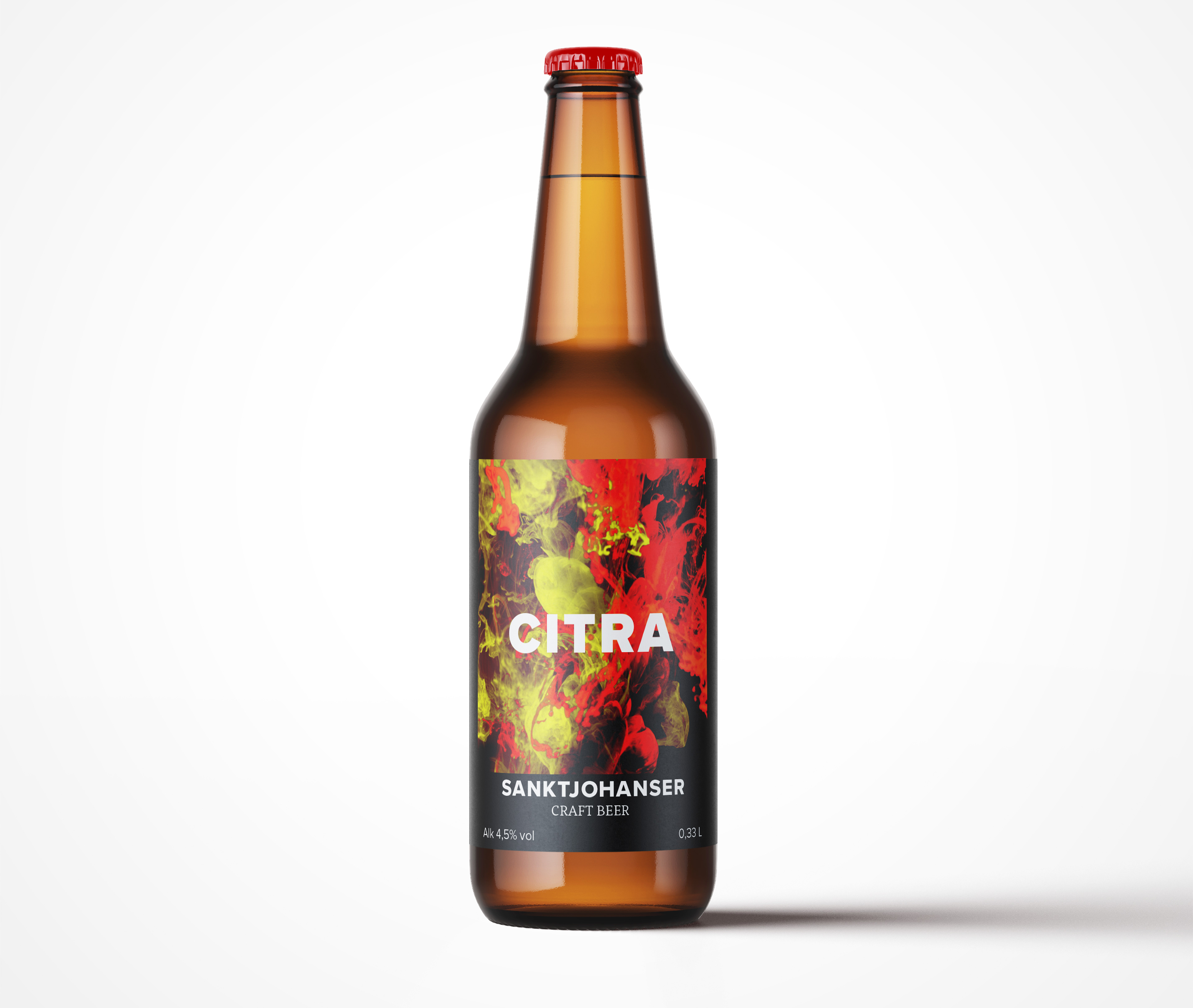
Here, the focus lies on young, experimental, tasty and fun.
The approach was to use clear and modern typography with aesthetic but abstract visuals. Those would represent the flavor, as well as the dynamic explosion of taste, while the clean typography on black puts product and flavor in focus. Also, this kind of contrast plays into the modern feeling the branding should represent.
Route 2
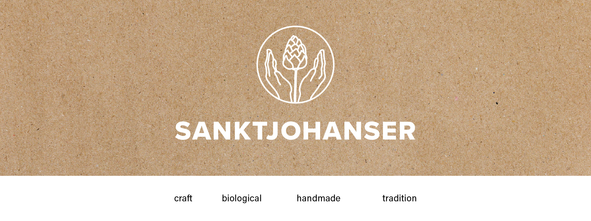
In this route, other values were put forth: craft, biological, handmade and tradition were to be represented by the branding.
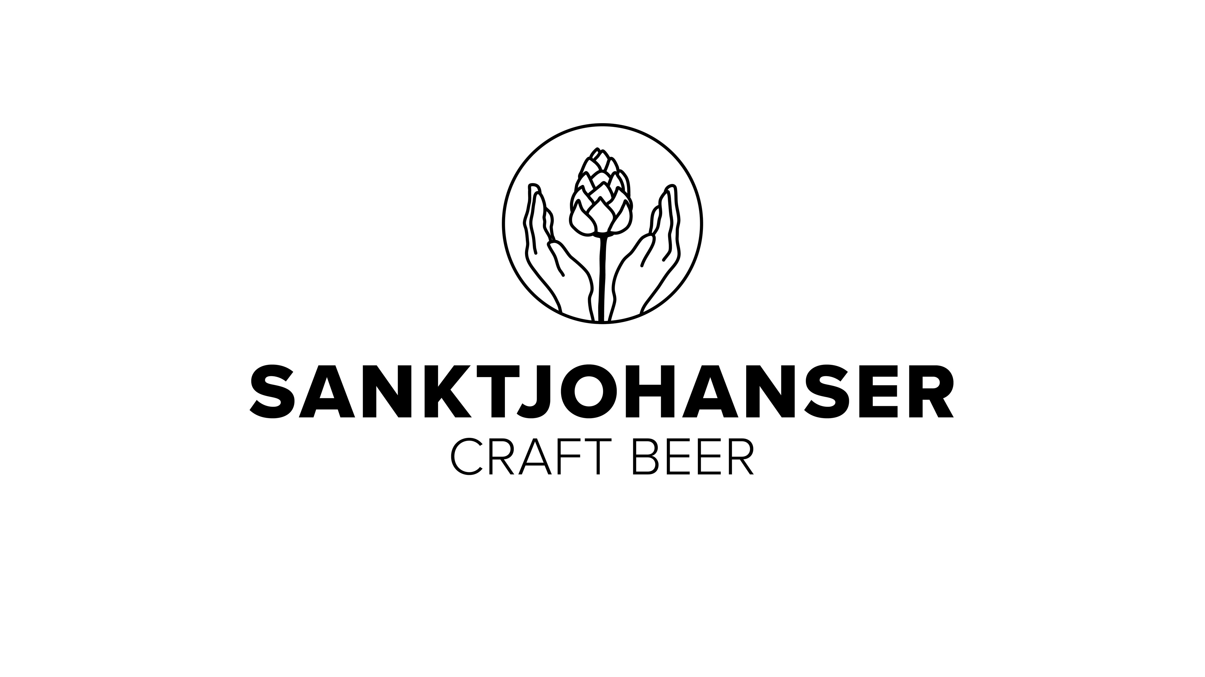
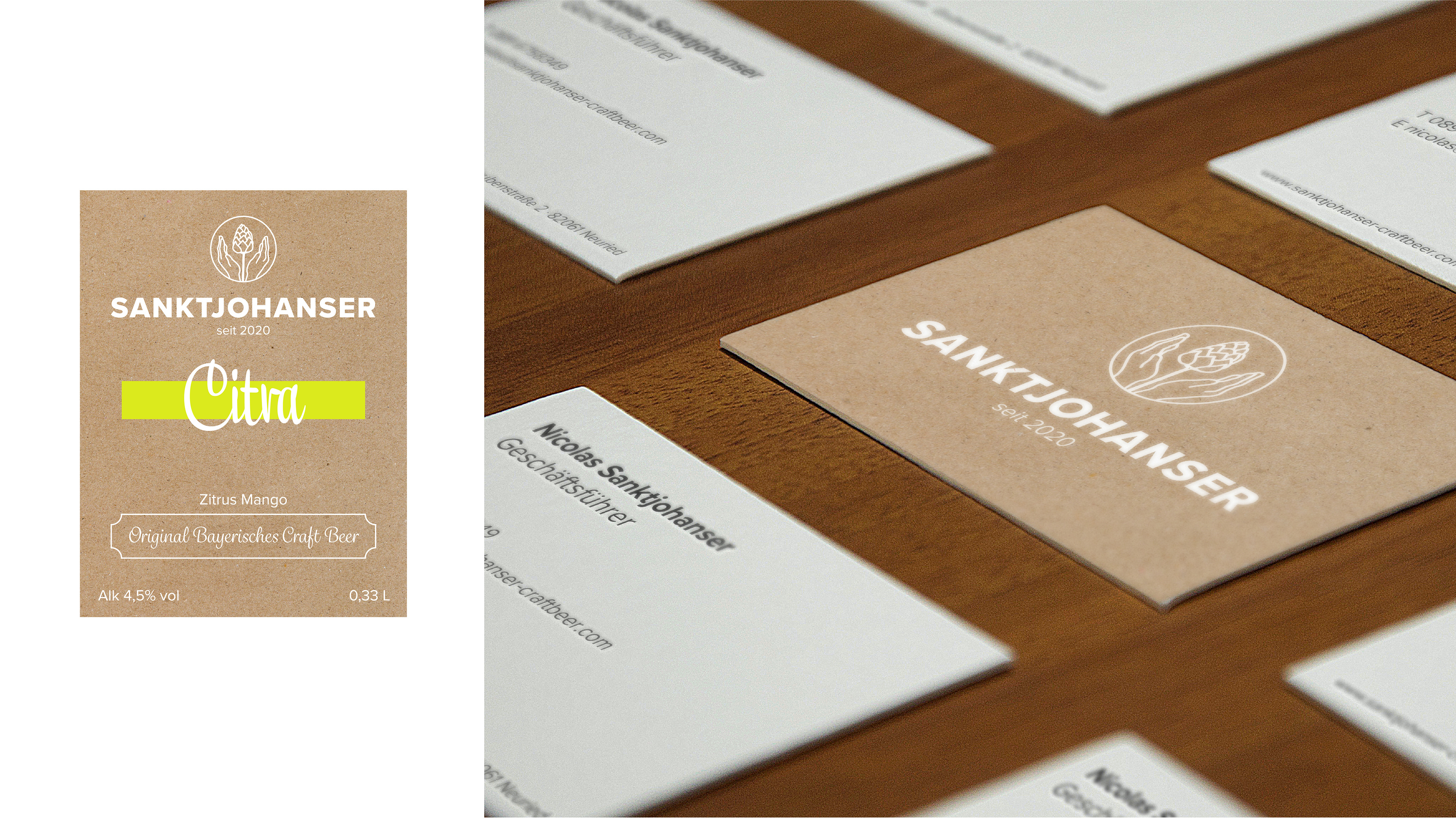
The logotype is complimented by an illustrated signet showing two hands worshiping hops. This motive as well as the illustration style stresses the values craft, handmade and tradition. For the biological look and feel, the logo and packaging were combined with a natural paper, which would emphasize this value additionally by touch.
To represent the handmade and traditional look of the signet, an additional typeface was added on the packaging. Grafolita script complements the paper and the logotype while giving reference to a handwriting and therefore handmade product.
Route 3
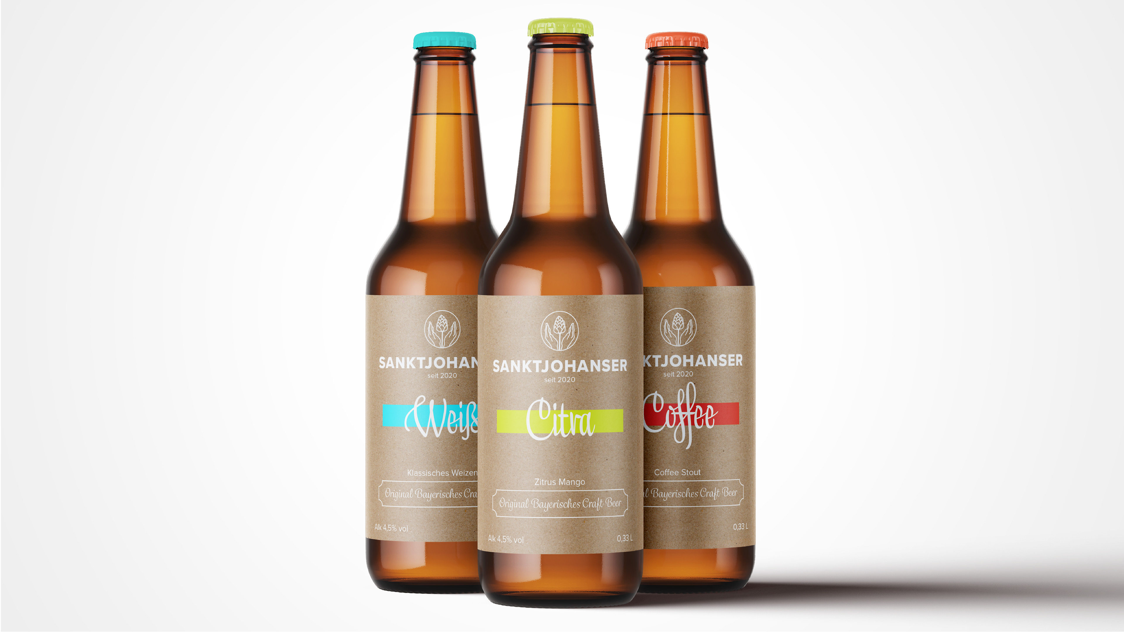
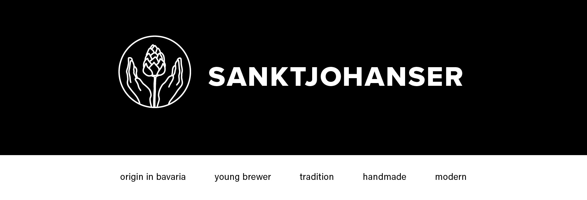
The last route would combine the two opposite values modern and tradition with young brewer, the origin in Bavaria and an emphasis on handmade.
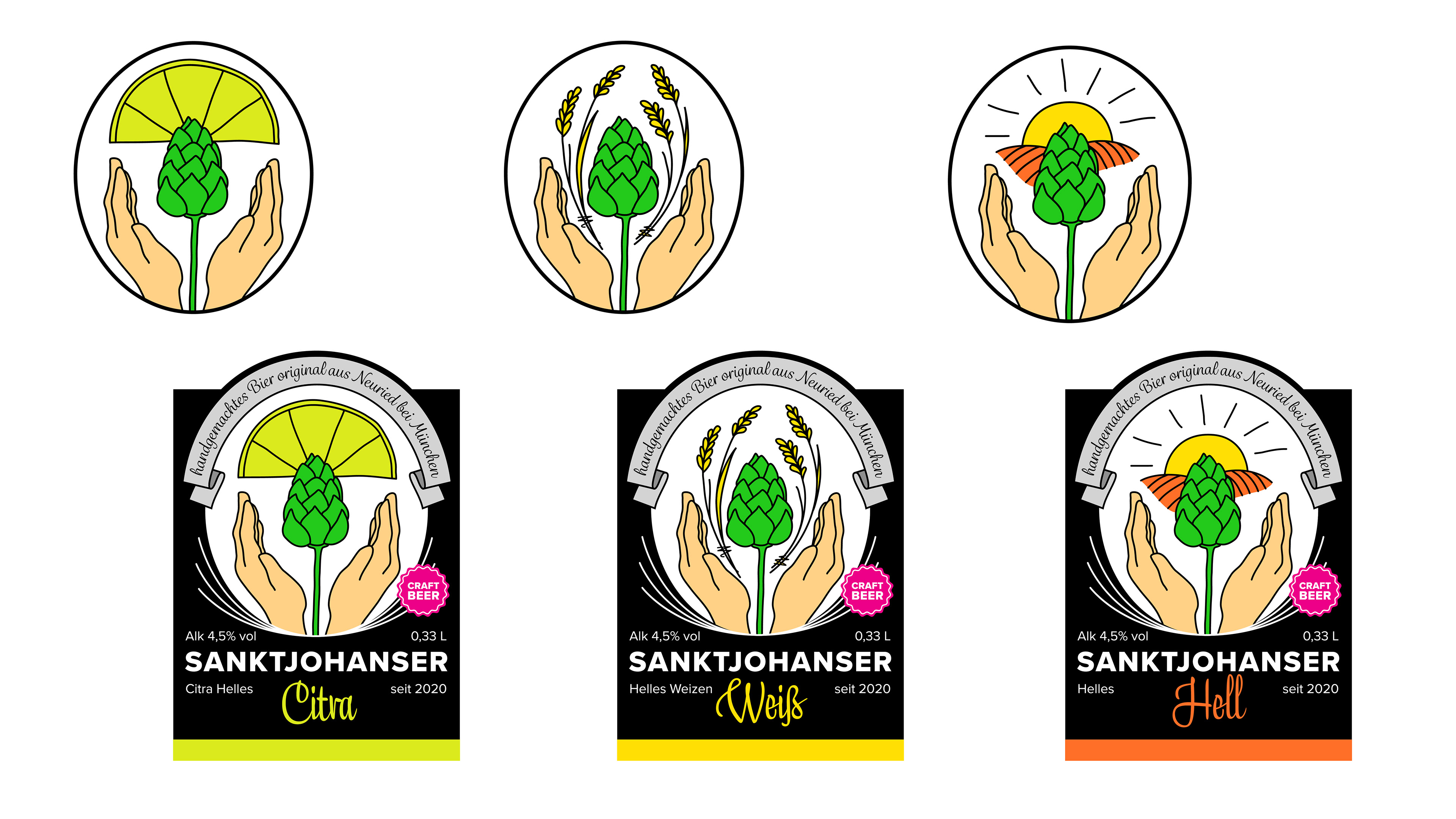
The illustrated signet shows the handmade character with its subject and style, while the clean logotype puts the modern and young feeling into focus. The signet was adapted but extended for the different flavors, keeping hands and hops as binding element. To make it look modern, neon colors were used, contrasted by clear black and white to keep balance in the design.
The form and composition of the label is a reference to traditional and well-known beer brands in Bavaria, which plays into the balance of tradition and modern.
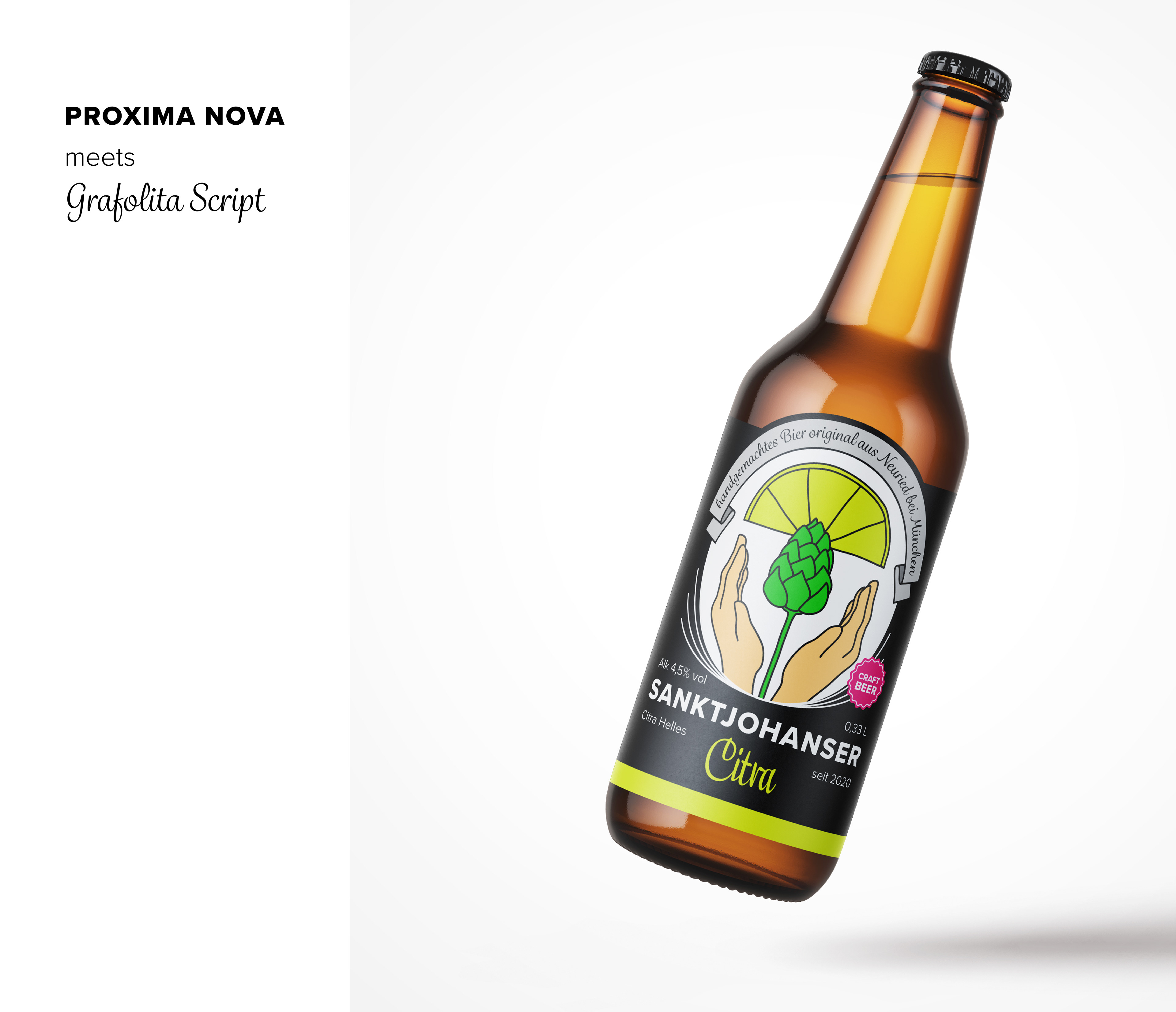
Like in route two, Proxima Nova was mixed with a script typeface. This helps to set apart the flavor from the Logotype and stresses the value handmade and tradition.
Thanks for watching!
personal project